Mobile phone usage on the web is growing at an alarming rate. We’re seeing, on average, about one third of website visitors have come via a phone instead of a desktop computer. This isn’t some overseas statistic – this is with our clients, right here in central Queensland. (And some of our clients have much higher percentages of mobile traffic.)
Consider: 1 in every 3 visitors to your website is trying to navigate, trying to read, trying to do something on a tiny screen. How does your site stack up?
In late 2010 we started using “responsive web design”, which in English means the same website displays differently on different sized screens. This allows us to reformat your website specifically for smaller devices, while still keeping traditional desktop-based designs for those on larger screens.
Given the numbers we’re now seeing, we’re now approaching every new website with a “mobile-first” strategy. Before we look at any desktop designs, we consider the mobile version of the website first.
We believe that’s the only sensible thing to do given the trend we’re seeing. Design for tomorrow, or yesterday?
Some US figures
Interestingly – we’re seeing higher percentages of mobile web traffic locally than in this graphic.
++ Click Image to Enlarge ++
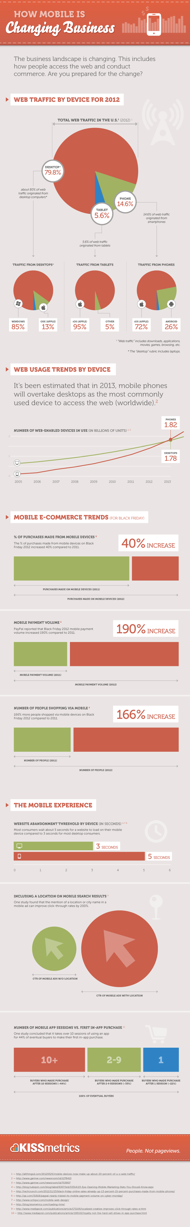
Source: How Mobile is Changing Business – Infographic